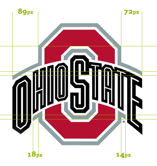
I am a stickler for details and balance so thought I would point out an example I recently saw that does a sub par job. Sometimes I can get tunnel vision and miss things too but the high profile logo of The Ohio State University should be perfect.
I noticed that my alma mater’s logo looked a little off. I did some digging and even contacted a friend of mine with an officially licensed logo in PDF format. It turns out that the logo is more than a little off. As you can see below there are some large balance issues that make the design appear “off”.

The logo looks OK on its own but only a keen eye for pixels can identify the balance issues a logo may have.
